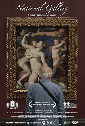
National Gallery Page #12
- No.
No, they're mine. They're mine.
They're mine. Thanks.
- OK. Got it.
- OK.
Action.
The Fighting Temeraire.
How different the mood would be
- if it weren't for the accent of...
- That's just coming off...
Still set.
Action.
The Fighting Temeraire.
How different the mood would be
if it weren't for the accent
of that black buoy.
If it weren't for the accent
of that black buoy.
But how exactly Turner gets
the balance between the two blacks,
the buoy and the tug, with that
precise sense of space between them,
the massive, heavy treatment of the sunset,
and then the subtle glow beneath,
it's very hard to say where light
meets darkness,
it's very hard to say where light
meets darkness,
so subtle is the grade.
How he gets all those things is
the essence of the success of the picture.
Water becomes a metaphor for feeling,
for yearning, the sense of loss,
the depth of emotion
that his subject is about.
A metaphor is a literary thing,
that comes from the mind.
But the painting is made powerful
by what's actually in it.
The precise shapes of those sails,
with the light shining on them.
And then, their repeat
in the sliver of light by the black buoy.
And then, the wonderful,
lively fullness of that sunset,
and the placid shimmer
of the blue cityscape on the horizon.
It's through the doing and the redoing
of all those calling and answering elements
that Turner makes light on the Thames
into such a tremendous metaphor.
OK. That will work.
Bit tricky with the leads.
Go behind you...
Got no handholds this time.
OK.
- That's it.
- Yeah.
- There we go, same again.
- OK.
Uh... I can get one. Hang on a sec.
- So... OK.
- 120.
Go all the way up.
OK. Good. Obviously, it's not a problem
because of that shadow.
- That's right.
- And how about the right wing'?
Did, erm...
Would these have adjusted down
on autumn?
- Haven't the levels dropped?
- The new fittings that you've added
will stay at a hundred per cent.
But the other fittings that were in the room
previously will have dropped, possibly.
Maybe what we should do
and set everything back
to the full output level.
- But these should be at a hundred.
- Exactly. Yes.
- Darren!
- Yep'?
Come back to the...
the light on the centre panel.
Can you see enough from up there
to see what's happening'?
- Yep.
- We've got a huge frame shadow.
I don't think there's going to be anything
we can do about that.
It's because the frames are causing it
to sit behind the glass so far back.
- Right.
- But...
Do you have your card handy?
Put your card over the first fixture.
Take it away.
Again.
Take it away.
Take it away.
Tweak that one up a wee bit too.
There you go.
OK, move along to the next.
Take it away.
Again. Take it away.
Let me let my eyes adjust a moment.
I forgot my sunglasses this morning.
I always bring my sunglasses up.
- Good.
- Kevin.
So that's 150 at the top.
All right, there, we're getting
more in line now. Good.
Good. Let's check the centre panel again,
because we've added this light.
And now the left... left wing.
- 140.
- That's a shame about the shadow,
- but I'm afraid there's just nothing...
- We've got to live with it.
Not without... backing it uncomfortably.
- Well, there's no more room, is there?
- There really isn't.
Wheelchairs... Let's go and use that...
You've been heroic.
With the exception of the shadow...
it's a lot better
than I thought it was gonna be.
So thank you guys very much.
No problem.
Go ahead, 0-1, over.
I'll take you to an extreme example.
We were discussing natural light,
and how now, no one notices
where the lighting is in the painting.
Like, where's this one lit from?
I think from this side...
Top left. Yeah.
And it's the fact that in the 17th century,
we know people were much more aware.
But when van der Doort
wrote the inventory for Charles I,
he recorded every painting and said
whether it was lit from the left or the right.
Which you just don't even do now.
Cos we're so used to electric light
coming down and doing it all for us,
- we don't realize...
- Right.
...It's important to record how it was.
I assume he did it
cos he was gonna hang the paintings
- according to which way they were lit.
- Yeah.
This was in a big church,
and you could probably find,
actually, which chapel it was in,
during the day,
how it worked, what was
the optimum time for it to be viewed.
So he probably never imagined that
it would be shown in this kind of context,
with electric lighting and...
No, and that's something
that you have got to address, in a sense.
We don't address it, we say
everything's gonna be designed
- to be seen dead front on, evenly lit.
- Yeah.
I can give you one... Cos we're nearby...
Let's go to the Rubens gallery first.
I'll show you an extreme example of that.
OK, this is exceptional,
cos we know where this painting was.
And it still exists, the actual venue,
it was in Rockox's own house
and it was above his chimney piece.
And chimneys in the 17th century weren't
like these little miserable things we get now.
The height of a chimney
was always about here.
That's the top ledge of it.
So it would have been at least that high.
You've got to imagine...
You're gonna have to look down on the...
You know, the painting's way above you
and you're looking up.
You could actually walk into chimneys
in the 17th century.
And you can gum, the lighting's on the left.
OK? That's where the windows were.
The windows were quite high too.
Now, it has one immediate effect,
which you don't get now,
when you light it evenly,
is the lighting is stronger on the left,
because that's the source
of the natural light.
And therefore,
it picks up her very strongly,
and the five figures
in the doorway look very faint.
And that's worth noticing,
because you wouldn't expect that.
And now, in this light, they look almost
as if they're competing spatially,
and they're very bright, you know,
the guys coming in to arrest him.
But when you actually
put it in its original place,
and we did this a couple of years ago,
switch off all the electric lights, which
always takes a bit of persuading to do,
you'll find the painting clicks and pops,
because those guys
fade back into the distance
and this stuff, it almost looks too harsh.
Because the light's stronger,
it becomes much smoother.
He must have known he was doing that,
cos he's made the contrast.
See, the ground's sneaking
through between the white.
You can see the warm ground.
So he's made it to catch the light
and so this is the focal point.
Would he have painted it in the same light
as it would have been displayed?
- Yes, he probably painted it in situ.
- Mm.
I mean, there's quite a lot of evidence that
artists did go and place paintings in situ.
Rockox was a friend of his.
And if not, he would have touched it up.
Translation
Translate and read this script in other languages:
Select another language:
- - Select -
- 简体中文 (Chinese - Simplified)
- 繁體中文 (Chinese - Traditional)
- Español (Spanish)
- Esperanto (Esperanto)
- 日本語 (Japanese)
- Português (Portuguese)
- Deutsch (German)
- العربية (Arabic)
- Français (French)
- Русский (Russian)
- ಕನ್ನಡ (Kannada)
- 한국어 (Korean)
- עברית (Hebrew)
- Gaeilge (Irish)
- Українська (Ukrainian)
- اردو (Urdu)
- Magyar (Hungarian)
- मानक हिन्दी (Hindi)
- Indonesia (Indonesian)
- Italiano (Italian)
- தமிழ் (Tamil)
- Türkçe (Turkish)
- తెలుగు (Telugu)
- ภาษาไทย (Thai)
- Tiếng Việt (Vietnamese)
- Čeština (Czech)
- Polski (Polish)
- Bahasa Indonesia (Indonesian)
- Românește (Romanian)
- Nederlands (Dutch)
- Ελληνικά (Greek)
- Latinum (Latin)
- Svenska (Swedish)
- Dansk (Danish)
- Suomi (Finnish)
- فارسی (Persian)
- ייִדיש (Yiddish)
- հայերեն (Armenian)
- Norsk (Norwegian)
- English (English)
Citation
Use the citation below to add this screenplay to your bibliography:
Style:MLAChicagoAPA
"National Gallery" Scripts.com. STANDS4 LLC, 2025. Web. 24 Feb. 2025. <https://www.scripts.com/script/national_gallery_14505>.


Discuss this script with the community:
Report Comment
We're doing our best to make sure our content is useful, accurate and safe.
If by any chance you spot an inappropriate comment while navigating through our website please use this form to let us know, and we'll take care of it shortly.
Attachment
You need to be logged in to favorite.
Log In